Compose, don't create
A production bug taught me that the useful thing about a building block is often what it won't let you do. That lesson matters more now that a non-deterministic model is the one assembling the pieces.

For about a month, one of our buttons had white text on a white background in production.
It shipped that way. Nobody caught it: not in review, not in QA, not in production. The button was still there, still clickable, still doing its job. You just couldn't read it. Someone had changed a style somewhere else entirely, and that change reached a place nobody thought to look.
That bug is what finally won the argument. But the bug was never the problem.
Our CSS was the kind you inherit rather than choose. Nothing was atomic. Styles were global, overrides fought each other, and a change in one place could surface three screens away. Every new page started with a negotiation: find the rules already in play, write something more specific, then check that you hadn't broken anything else. We were spending real time on work that produced nothing a customer would ever notice.
What we built
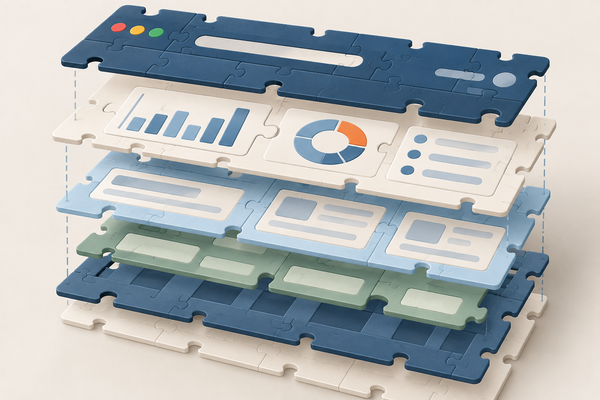
I put together a proof of concept on my own time, working with a designer who cared about the problem as much as I did. We started with design tokens, which are named decisions for color, type, and spacing, then built a small set of components on top of them. Then I showed the team what it looked like to assemble a page instead of styling one.
We documented all of it in Storybook: every component, its variants and states, and a working example. We also wrote down the dos and don'ts, which mattered more than I expected. A button label could be one to three words, not a sentence. Sentence case, not title case.
Those rules aren't technical. You can't enforce them with a type signature. They're decisions about how our product speaks, and writing them down next to the component meant nobody had to make them again.
The part people skip
Nearly everything we built wrapped a third-party component library. In the codebases I've worked in, wrapping is the step that gets skipped, and it's the step that did the work.
Take a date picker. A good third-party date picker works anywhere on earth. It handles locales, formats, first day of the week, right-to-left layout. All of that is a feature for the library's authors and a liability for us. We shipped to an American audience and had standardized on MM/DD/YYYY. The decision was settled, but every engineer who touched a date picker still had to set it, and every engineer who touched a date picker could get it wrong.
So our wrapper didn't expose it. Not defaulted. Not documented as "usually this one." The parameter wasn't there.
That's the whole idea, and it's worth saying plainly: the useful thing about a building block is often what it won't let you do. Every option you expose is a decision somebody has to make, over and over, forever. A block earns its place by making that decision once.
We also decided that "production-ready" had to mean something specific. Every component in the library had functional tests, visual regression tests, and accessibility tests. That bar is why I can tell the white button story as history rather than as a warning, and the tests are the smaller half of the reason. The button's appearance stopped coming from a global cascade that an edit three screens away could reach. There was no longer a place to make that mistake from. The regression tests cover the second half: a component whose rendered output changes without anyone intending it fails its check, and the pipeline stops there. Neither of those is a guarantee about every screen in every state. Together they mean the failure no longer depends on somebody happening to look.
The result was better than the hypothesis
Going in, my hypothesis was that the most junior engineer on the team should be able to assemble the UI for any screen in our product in a day. That turned out to be true, but it undersold it.
Engineers stopped touching CSS. Accessibility stopped being a separate task someone remembered late, at least at the component level. The assembled page still needed checking. People fell into the pit of success: by default things worked the way they were supposed to, and doing the right thing was easier than doing the wrong thing.
Then the Design team started building UI in code.
Our worst cycle had always been the handoff. Design would produce something in their design tool, something akin to an image. It wasn't alive. An engineer would implement it, we'd finally interact with the real thing, and we'd discover the hover state was wrong or the animation felt off or nobody had thought about the empty state. Back it went.
Once the components were real and composable, I could set a designer up with a starting point and they could take it from there: adjust the animation, try the interaction, watch the thing breathe before an engineer opened a ticket. Design decisions got made against something running instead of something static.
One honest caveat: the designer I worked with was genuinely good at CSS, and that isn't something every team can count on. I don't know how much of this result depended on it. It's also one of the few places where I think the ground has since shifted. A model can write the CSS that designer knew, so the dependency I couldn't generalize from then is the one I'd expect to have weakened most since. I haven't tested that, and nothing in the React Native project tests it either.
The same problem, restated
None of this was about AI. We built it years before I had a model writing code for me.
But the problem it solved is the problem I have now, wearing different clothes.
A model is a capable generalist with no memory of the decisions your team has made. So is a new hire. Two things separate them. A new hire accumulates context as a by-product of showing up every day; a model has only what its environment was built to hand it. And a new hire is at least (hopefully) consistent, while a model is non-deterministic. Ask twice and you can get two answers, both plausible and both confident.
Point one at an unconstrained system and it does what an unguided junior engineer does, only faster. It writes CSS. It picks a date format. It labels the button "Click here to submit your order for processing," because nothing told it not to, and it labels the next one differently.
There are two ways to fix that. Give better instructions, or leave fewer decisions open.
Most of the advice I run into is about the first one: longer prompts, richer context, more elaborate rules files. That work matters and I do it too, but it has a ceiling: an instruction is something a model can fail to follow. A parameter that doesn't exist is not.
Our date picker didn't teach anyone the American date format. It removed the ability to set a date format at all. Those are different in kind. One lowers the odds of a mistake; the other eliminates a category of them altogether.
You can see it in the spec
Say the request is an order history page. A customer picks a date range and a set of statuses, sees the matching orders in a table, pages through them, and clicks into one. Both specs below describe that same feature.
Neither project in this post had this page. It's an illustration, and the short version assumes a system where the pieces it leans on have already been built and are already trusted.
Without blocks, the spec carries every decision. A style guide would shorten it, but only by moving the decisions somewhere a person has to remember to look. A component is the same decision made enforceable, which is the difference between documenting a convention and implementing it.
Build the order history page.

Page title: "Order history", 24px/600, 32px of space below it.

Layout: two columns. Filters left at one-third width, results right at
two-thirds, 24px gutter. Below 1024px, stack vertically with filters
first, full width.

Filters panel: white surface, 1px #E4E4E7 border, 6px radius, 16px padding.

  Date range: a select labeled "Date range" with the options "Last 30
  days", "Last 90 days", "Last 12 months", "All time", and "Custom".
  Default to "Last 90 days".

  Choosing "Custom" reveals two fields beneath the select, labeled
  "Start date" and "End date", side by side above 480px and stacked
  below it. Each is a text input with an MM/DD/YYYY mask that inserts
  the slashes as you type, plus a calendar button at the right edge
  that opens a month grid. The end date is inclusive.

  Invalid values: a month above 12 or below 1. A day above the number of
  days in the entered month, which makes 02/29 valid in 2028 and invalid
  in 2027. A two-digit year, so "01/01/25" is rejected rather than read
  as 2025. A date later than today. An incomplete value. An end date
  earlier than the start date.

  Validate on blur and again on submit, never while typing. Show the
  message beneath the offending field in #B42318, 12px:

    month out of range   "Enter a month between 1 and 12"
    day out of range     "That month doesn't have that many days"
    not a real date      "Enter a date as MM/DD/YYYY"
    future date          "Pick a date on or before today"
    end before start     "End date must be on or after the start date"

  Keep "Apply filters" disabled while either field is invalid.

  Status: a multi-select labeled "Status", rendered as a checkbox list,
  options from GET /v2/orders/statuses. None checked means all statuses.

  Primary button labeled "Apply filters": #1B4DFF background, white text,
  14px/500, 8px vertical and 16px horizontal padding, 6px radius, hover
  darkens 8%, focus ring 2px at 2px offset, disabled at 40% opacity with
  pointer events off. Disabled until a filter changes. On click, fetch
  page 1 with the current filters.

  Text link beneath it labeled "Clear filters": #1B4DFF, underlined on
  hover. Resets to the defaults above and refetches.

Results table: no zebra striping, 1px #E4E4E7 row borders, 12px cell
padding, header row 12px/600 uppercase in #71717A. Columns in order:

  "Order"        order number, left-aligned, monospace
  "Date placed"  MM/DD/YYYY, left-aligned
  "Total"        USD, right-aligned, always two decimals, $1,234.56
  "Status"       plain-language label from the mapping below, left-aligned

Rows navigate to /orders/{id}. Hover background #FAFAFA, pointer cursor.
Each row is a single tab stop whose accessible name is the order number.

Pagination: 25 rows per page. "Previous" and "Next" beneath the table
with "Page X of Y" between them, each disabled at its end.

Fetching: GET /v2/orders with the session bearer token and query params
for range, status, and page. Retry twice on 502/503/504 with backoff
from 200ms. On 401, refresh the token once and retry. Timeout at 10s.
The error envelope is { error: { code, message } }.

Loading: four skeleton rows matching the column widths, header still
visible. Don't blank the table during a refetch, and discard a response
that arrives after a newer request was sent.

Which empty state to show: an empty result for the selected range does
not establish that the customer has never ordered. Read `lifetime_order_count`
from GET /v2/customers/me. Zero means they have never ordered; anything
higher means the filters excluded everything.

Never ordered: "You haven't placed any orders yet", centered in the
table area, 14px #71717A, with a "Browse products" link beneath it
pointing at /products.

Has ordered, nothing in range: "No orders match these filters", with a
"Show all orders" action that sets the range to "All time", clears the
statuses, and refetches. Note that this is not the same as the panel's
"Clear filters" link, which returns to "Last 90 days" and would hide
older orders again.

Failed to load: "We couldn't load your orders", with a "Try again"
button that refetches.

Status labels: customers see plain-language explanations, not internal
status codes. Mapping still to be written, and it needs product
sign-off. Nothing here can supply it.

None of the above covers the timezone those dates are interpreted in,
what a screen reader announces when a field goes invalid, or what
happens when someone pastes a value. Keep going.
With blocks, it carries only what's actually new. Assume the things a system settles once are settled: how dates and money are written, what a date range accepts, how a table paginates and behaves under a keyboard, and what every client does about auth and failure.
Build the order history page.

Page title: "Order history"

Layout: two-column, 1:2 split. Filters left, results right.

Filters:
  Date range: date range filter, default "Last 90 days". Presets: last
  30 days, last 90 days, last 12 months, all time, custom.
  Status: multi-select, options from the orders client. None selected
  means all statuses.
  Primary action "Apply filters", disabled until a filter changes. On
  apply, fetch from page 1.
  Secondary action "Clear filters", resets to the defaults and refetches.

Results: data table, 25 per page, rows link to the order detail page.
  "Order"        order number
  "Date placed"  date
  "Total"        currency
  "Status"       plain-language label

Data: the orders client, filtered by date range and status.

Which empty state applies comes from the customer's lifetime order
count, not from this page's results. An empty range doesn't mean an
empty history.

States:
  never ordered          "You haven't placed any orders yet",
                         with a "Browse products" link to the catalog
  nothing in this range  "No orders match these filters",
                         with a "Show all orders" action: set the range
                         to "All time", clear the statuses, refetch.
                         Not the same as "Clear filters", which returns
                         to "Last 90 days" and hides older orders again
  failed to load         "We couldn't load your orders"
                         (the error state brings its own retry)

Status labels: customers see plain-language explanations, not internal
status codes. Mapping still to be written, and it needs product
sign-off. Nothing here can supply it.
The second one isn't shorter because I trimmed it. Both specs describe the same page. Everything absent from it is absent for a reason:
- What happens when a customer picks "Custom." The date range filter already knows. It reveals the two fields and labels them, it knows how many days February has this year, it rejects a month of 13, it refuses an end that falls before the start, and it has the wording ready for each of those. Somebody decided all of it once, and every date range in the product behaves the same way because of it.
- Whether the table keeps its rows on screen while the next page loads. It does, and a slow response from an abandoned request gets discarded rather than rendered. Those aren't order history problems, they're table problems, and they were solved the first time anyone hit them.
- What to do about a timeout, an expired token, or a bad gateway. The orders client carries those answers, and it carries the same ones every other client in the system gives.
- Column alignment, the keyboard behavior of a row, the breakpoint where the two columns stack. All owned elsewhere, all decided already.
None of that is missing from the product. It's missing from the spec, which is a different thing. Every one of those decisions still gets made. It just got made once, deliberately, by someone who was thinking about that problem, instead of getting re-made by whoever picked up this ticket.
There's a second cost to the first spec, and it's the one that worries me more. Every line in it is a line somebody has to write correctly, and then a line the model has to read correctly. "A day above the number of days in the entered month" is four words away from being wrong, and it's exactly the kind of sentence that gets skimmed. Length isn't only expensive to produce. It's more surface where an instruction can be misread, and a misread instruction doesn't announce itself. It looks like working software until somebody files a bug in February.
What survives is everything a customer could notice and no engineer could reasonably guess: the labels, the defaults, the presets, the copy, the rule that Apply stays disabled until something changes, and the decision that selecting no statuses means all of them. The table brings the empty state; the words in it are still yours. The error state brings its own retry, so nobody has to ask for one.
The line is finer than copy versus behavior. "End date must be on or after the start date" is copy, and it still belongs to the date range filter, because every date range in the product says it. "You haven't placed any orders yet" is copy that only this page could know. The test isn't whether a line describes words or logic. It's whether anything outside this feature could have decided it.
Notice too that the second spec doesn't name a single component. "Two-column, 1:2 split" and "data table" are names in the design system, not names in a codebase. That matters if you ship more than one client: the same spec can drive web, iOS, and Android, with each one resolving those names to its own implementation. The shared entity is the vocabulary.
One line appears in both specs, word for word: the status mapping. Neither version can compose it, because nothing in either system knows what a customer should be told about an order that hasn't settled. That's the gap. Neither system can close it, and the honest thing for a plan to do is name it and say it's waiting on an answer nothing in the codebase can supply.
The model assembles; it doesn't author
This reframes the job I'm handing over.
It isn't that a model has opinions about buttons. It's what you're relying on when you describe one. You're relying on the description being complete: every time, on every screen, from everyone who writes one. And you're relying on the model following all of it.
Where the description stops, the model keeps going. It fills what's left with something plausible, it does that without mentioning it, and it could fill it differently the next time you ask. Where the description is perfectly clear, you still have no assurance: a state gets dropped, a rule gets ignored, and the result looks close enough to pass a review that wasn't checking it line by line.
A component takes both of those off the table, because the decision never travels through the model at all. It was made once, deliberately, by people who knew the system and the reasons it worked the way it did, and it lives in the block. Within that interface there's nothing to fill in and nothing to drop.
That isn't the same as saying the model can't be wrong. It can still reach for the wrong block, wire two of them together poorly, bypass the wrapper and style something by hand, or edit the component itself. Those are real, and they're why composition still gets reviewed. The difference is that they're a much smaller set of mistakes than "everything about how this page looks and behaves." Not all of them are easy to spot. Two sensible arrangements of the right components can both pass a review that's looking at one screen. But it's a small enough set that you can know what you're looking for.
What I want from the model is the part that genuinely varies: wrapping business logic around pieces that are already trustworthy, choosing the composition, connecting them, and telling me what's missing.
That's an orchestrator. It's a narrower job than "write the feature," and a far more reliable one, because the surface where it can be wrong is the surface I actually want it thinking about.
What stays yours
Composition doesn't remove judgment. It relocates it.
The status labels in that spec are a real example. Nothing in a component library can tell a customer what pending_settlement means, or whether their order can still be canceled. That's a product decision, and a developer shouldn't be guessing at it, which makes the gap a signal rather than a nuisance. A conversation needs to happen before the code gets written.
It's tempting to draw the line between mechanism and policy, and put every mechanism in a block. That line doesn't hold. Our date picker encoded a policy: one date format, chosen by us, for our product. So did the rule about how many words go on a button. A design system is mostly policy, and that's the point of it.
The question that does hold is the one from the spec: could anything outside this feature have decided it? The date format could. The product settled that once and every screen inherits it. What pending_settlement should say to a customer could not, because nobody had decided it yet. That answer might end up shared with the order detail page and every notification we send. What it can't be is invented here.
Some things shouldn't be blocks at all, though the test isn't how many times you've used it. A modal, an email field, a date picker: each belongs in the library the first time you need one, because everybody already knows what it should promise. The risk is the thing you assembled once for one screen and don't yet understand well enough to describe. A block is a promise, and you can't make a promise you can't state. Neither should two pieces of code that merely resemble each other, when their rules need to change independently. And be careful with the part of your product that's actually differentiated. Reusable pieces belong inside it too, but reaching for the generic answer on the surface that's supposed to be yours is how a distinctive product ends up looking like everyone else's. The reason to make the ordinary ninety percent cheap is to have something left to spend on the ten percent nobody else has.
I ran it again, this time with a model
Everything above happened before models wrote code. This year I got to test whether it still holds when one does.
I was loaned to a team for two weeks to help rewrite their app in React Native. With one other person I built a component library of more than forty components: tokens underneath, tests including accessibility, Storybook for documentation and usage rules. I also wrote the skills that generated the components, and then the specs that consumed them, written against the components we'd built rather than against React Native primitives.
The library didn't come first. We built what the first part of the app needed, ported that part, found what was missing, and built that before starting the second. Two weeks had to cover the skills, a spec for each component, the components themselves and the ports, so front-loading only enough to prove the idea was the point.
We ported three complex parts that way. The second went faster than the first, and the third faster than the second, with less rework and fewer visual inconsistencies between screens each time.
Not all of that came from having more components. A good share came from hardening the skills. I'd ask the model why it had done something, or why it hadn't, and turn the answer into a rule. That sounds like it argues against everything above, and it's worth being precise about why it doesn't: every rule I hardened was a rule about composition. Which block to reach for. How to assemble them. How to report one that didn't exist yet. I never wrote a rule about focus rings or date formats, because those weren't decisions the model was making. The instructions got better because the blocks had already shrunk what the instructions had to cover, and a small problem is one you can converge on.
Two things I can't tell you. Two weeks says nothing about what that library costs to maintain. And I can't tell you the project went faster overall than it would have without the library, because there was no second team building the same app the other way. What I can tell you is the trend inside the project, with the same two people on the same codebase, getting quicker and cleaner with each port.
Wider than the UI
Both of those runs were UI, and that's where my evidence stops. But nothing in this argument is strictly about UI.
An API client. A validation layer. Job runners, formatters, parsers, permission checks, the taxonomy of your analytics events. Each one is a place where a decision either lives in a single reviewed location or gets re-made, slightly differently, every time somebody needs it.
I want to be precise about where the evidence stops. I've watched this work on the UI twice, once with a team of people and once with a model, at two companies, years apart. Everything past the UI is conviction. I believe the same move applies for the same reason, and that belief is doing no work in this post.
Start with the question
The question is free. Before the next feature: what does this need to do, which of those responsibilities already have an owner, and where is the real gap?
The answer won't be an empty file. It'll be a short list of things you already trust and a small number of decisions that are genuinely yours, which is a much better place to point a model, or a new engineer, or yourself.
A button with white text on a white background sat in our product for a month. What fixed that wasn't more care. It was removing the place where the mistake could be made, so that nobody had to catch it.