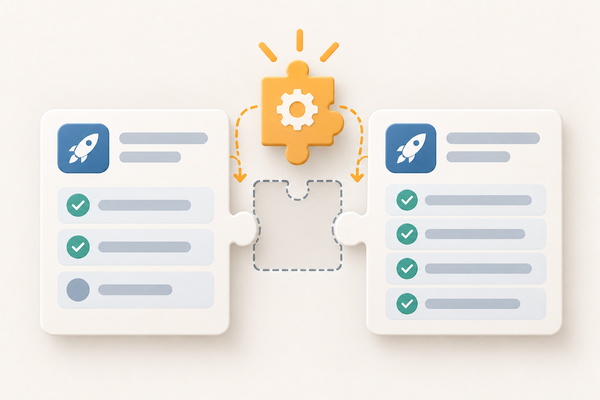
Composite components: the layer in between
An avatar, a name, a job title. A component library settles each piece. It doesn't settle the arrangement, and that layer needs an owner and a way to be found.

An avatar, a person's name, and their job title on the line beneath it. Three pages in the app needed that arrangement.
The model built it again on each one. Two of them used our Avatar, our Copy and our FlexBox, assembled in the file that needed them. The third reached past all three and used React Native primitives. The gaps and the font sizes didn't match.
The component already existed, a few directories away, made of exactly those pieces. The model never found it.
The library grew as we went
We didn't build the library and then use it. We built what the first part of the app needed, ported that part, found what was missing, and built that before starting the second. Two weeks had to cover the skills, a spec for each component, the components themselves and three ports, so front-loading only enough to prove the idea was the point. We ended with more than forty components, and none of them existed on the first day.
So the library and the app grew together, which is how I ended up watching the model build things that should already have existed. Some of what it built belonged in the library. Some of it belonged in neither.
Three kinds of code, not two
The first post in this series talks about blocks and features as if code comes in two kinds: the shared, production-ready pieces a system owns, and the business logic wrapped around them. There are three. The middle one is the one we kept rebuilding.
Library components. Shared, tested, documented, owned by the design system. Avatar. Copy, which took a size from our scale rather than a number. FlexBox, which let you set the flow of its contents and would not let you reach past it into arbitrary layout styles. We knew what we wanted to allow and what we didn't, and the component is where that got written down.
Composite components. Built from library components, or from other composites. They belong to the application. The avatar with the name and the title was one. I'll call it Nameplate here, because I've lost the name we actually gave it.
Features. The business logic that arranges both and talks to the rest of the system.
What the library left open
Look at what a library component settles and what it doesn't.
Copy decided which type sizes exist. It could not decide which one a person's name takes when it sits next to an avatar. FlexBox decided how we express layout. It could not decide that these three pieces stack this way, with this gap, every time they appear together.
Those are real decisions. They have to be made somewhere, and the library had deliberately not made them. A scale constrains the choice without making it.
Which is why the gaps and the font sizes didn't match. Nothing had settled them, so the model settled them, three times, in three files. Nameplate is where they were supposed to get settled once.
That is the whole case for the middle tier. You build the library, and then you keep assembling app-specific pieces out of it, and those pieces become assemblable in turn. That last part is why we kept each composite small. A small composite can become part of a larger one; a large one can only be used whole.
The ownership question, with three answers
The first post gave one question for deciding what belongs in a block: could anything outside this feature have decided it? The date format could, so it lives in the block. What pending_settlement says to a customer could not, so it stays with the feature.
That question implies two answers. There are three.
- The design system decided it.
- The application decided it.
- This one screen decided it.
A composite is the middle answer, and it's a real answer rather than a hedge. Ask that question of Nameplate and the honest reply is that something outside this feature decided it, and that something was the app.
Which gives the line I'd keep if I only got one: a component belongs with the people who own the decisions inside it. The design system owns what a button is. The app owns what a Nameplate is. Put either one somewhere else and you have put a gate between a decision and the people making it.
The same component, in the web app
I know what that gate costs, because I built one.
Nameplate also exists in the web version of the app. There I put it in the shared component library, which lived in its own repo and served every web app we had. It was used on the professional details page and a few others, all of them in our public-facing app. The internal apps never took it. They were denser and more data-focused, and the look didn't fit them. So a component sitting in a shared library across a repo boundary was, in practice, owned by one app.
Changing it cost what cross-repo changes cost. A pull request in the other repo, a version bump, a release, and a review from the short list of engineers with approval rights on the component library. Those controls were the right thing to have on shared infrastructure. On this component they put people who didn't own the decision in front of the people who did.
That's why the React Native library stayed primitives-only. There was one React Native codebase, so every composite lived in a shared components directory inside the app, where the people changing it were the people who owned it.
The same component, two codebases, two ways to get it wrong. Once for being promoted past the people who owned it, once for sitting exactly where it belonged and never being found. Where a component lives and whether it can be found are different problems, and the rest of this is about the second one.
Two failures, one tier apart
The model was getting this wrong in two different ways, and they need separating because the fixes aren't the same.
Sometimes it skipped the library. It would take a React Native primitive and style it directly with Tailwind classes instead of using FlexBox. That's bypassing the wrapper. I conceded last time that composition doesn't stop a model doing exactly this, and here is that concession cashing out.
Sometimes it skipped the composite. It rebuilt Nameplate inline, out of the correct library pieces, in the file that needed it. Nothing in that code is wrong on its face. It passes review, because a reviewer looking at one pull request is looking at three well-chosen components arranged sensibly.
That second one is the one we didn't catch. A wrong date format is visibly wrong. Two copies of the same arrangement, one differing from the other by a gap value and a step on the Copy size scale, are each defensible alone. What it costs shows up later, when there are three of them and somebody is asked to change all three.
How the model finds what already exists
Both failures needed the same thing first: a way for the model to determine whether a component already existed.
Every component in the library and every composite in the app carried an extensive JSDoc block at the top of its file. What it does, what it's for, and the dos and don'ts. The skill said where to look.
That's worth pausing on. In the design system I wrote about last time, the dos and don'ts lived in Storybook, because people were the readers. This library had Storybook too, and the same rules went into the top of every file as well, because the model was reading the code rather than the documentation. Same guidance, written in both places, because it had two kinds of reader.
This was not the implementation I want. Discovery belongs in something like the Storybook MCP server, and that was never in scope here. Two weeks to build a component library, write the skills that generated it, and port three complex parts of an app was already an aggressive goal, and I knew going in that the discovery mechanism would be the crude version. JSDoc headers worked at the size we ran them, and I'd expect them to keep working past forty-odd components, but they ask the model to load and re-read too much on every pass. I left that as an open action item rather than a solved problem, and I'd rather say so than present it as a design.
Compose, don't create
The rule I added was the one this series is named after: build from the components that exist, and when you can't, say so in the plan instead of inventing one.
It wasn't right the first time. It got there through a loop that deserves a post of its own, so here's the short version. Every time the model turned a spec into an implementation plan and failed to reach for a component it should have, I asked it why. Not "do it correctly", but justify the decision you made. Then I had the model harden the rule in the skill based on its own answer.
The implementation plan is worth a sentence, because a later post turns on what happens when it comes back with that second list non-empty. It was a gap analysis as much as a schedule: the business logic the feature needed, and the components that would have to be created before any of it could be built.
Two details in that are load-bearing. The first is that the catch happened at the implementation plan, before any code existed, which is a cheaper place to find it. The second is that every rule I hardened was a rule about composition. Which piece to reach for, how to tell whether it already exists, and how to report one that doesn't. None of them were about which gap or which type size to use. That was Nameplate's job by then, and the rule only had to get the model to reach for it.
That's also the honest tension in this post. The argument in the first post is that instructions have a ceiling and a missing parameter doesn't. The fix here was partly an instruction, and instructions are exactly the thing that can be ignored. What made it converge was that the blocks had already shrunk the instruction down to a question the model could answer.
Where a shared library should stop
Primitives-only was the right call for one codebase. I haven't had to defend it against two, so here's what I'd do.
I'd scope a shared library by audience as well as by technology. Technology scopes it already, and not by choice: a React Native component is no use to a web app. The axis that gets forgotten is who the app is for. A second public-facing app would get a shared library for public-facing pieces, and Nameplate would go in it. I'd expect a second internal-facing app to overlap little enough with the public one that sharing past the primitives wouldn't pay, though that's a read on our two audiences rather than a rule. Something with real overlap across both would go in the component library proper.
What I'd avoid is the move that reads as obviously correct, which is promoting a composite the moment a second app exists. Two apps for two audiences have two different ideas of what the same thing should look like, and the web app is what that costs.
What stays yours
Composites move a class of decision without removing judgment, and the judgment they ask for is harder than the library's.
A library component is easy to be right about. A modal, an email field, a date picker: you can commit to those the first time you need one, because everybody already knows what they should promise. That was the rule then, and it holds.
A composite is the case that rule was warning about. It's the thing assembled once, for one screen, that you may not yet understand well enough to describe. Build it too early and every screen after it inherits an arrangement that was a guess. Build it too late and you get the three copies I opened with.
I don't have a clean test for that timing and I'd distrust one. The weaker rule that held up: if you can say what the piece promises in a sentence, without naming the screen you first built it for, it's a composite. If you can't, it belongs to that screen until somebody can.
And none of this stops the model reaching for the wrong composite, wiring two together badly, or editing one in place. It removes a particular way of being wrong. It doesn't remove review.
The limits
This is lived. Composites are what the React Native run produced, not a structure I drew up in advance, and the mistake in the web app is mine.
Two weeks says nothing about what a composite layer costs to maintain. There was no second team porting the same app without one, so I can't tell you what share of the speedup belongs to this tier rather than to the library underneath it or the skills above it. The audience-scoped library above is what I'd do next time, not a thing I've done. And the discovery mechanism was the part I knew was temporary while I was building it.
What I can report is the shape of the three ports. Same two people, same codebase, each port faster and with less rework than the one before it, and a composite layer that was larger at the end of every port than it was at the start.
Back to the screen
The model rebuilding that avatar and those two lines of text wasn't carelessness. It was reaching for the best thing it could see, every time, with no memory that it had already solved this and no way to check.
The first post ended on removing the place where a mistake could be made. This one is smaller and less satisfying. The component existed. The decision had been made. It was sitting in the right directory, owned by the right people, and none of that reached the file where the model was working.